Support site redesign
Enterprise B2B SaaS / Web
Project context and goals
RingCentral support website is a comprehensive knowledge and self-service platform designed to help users resolve issues, learn product functionality, and access educational resources.
This project involved a complete redesign of the support experience, addressing fundamental usability, navigation, and information architecture challenges.
Design goals
Redesign the support experience to:
Improve content discoverability
Establish a clear and scalable navigation model
Simplify access to knowledge base resources
Reduce friction across user journeys
Align the interface with the design system
Please note: the screens shown highlight the core pages, not the full end-to-end flow.
Problem
The legacy support website had significant UX barriers:
No global navigation
Confusing product navigation on the home page
Excessive page nesting and deep content hierarchies
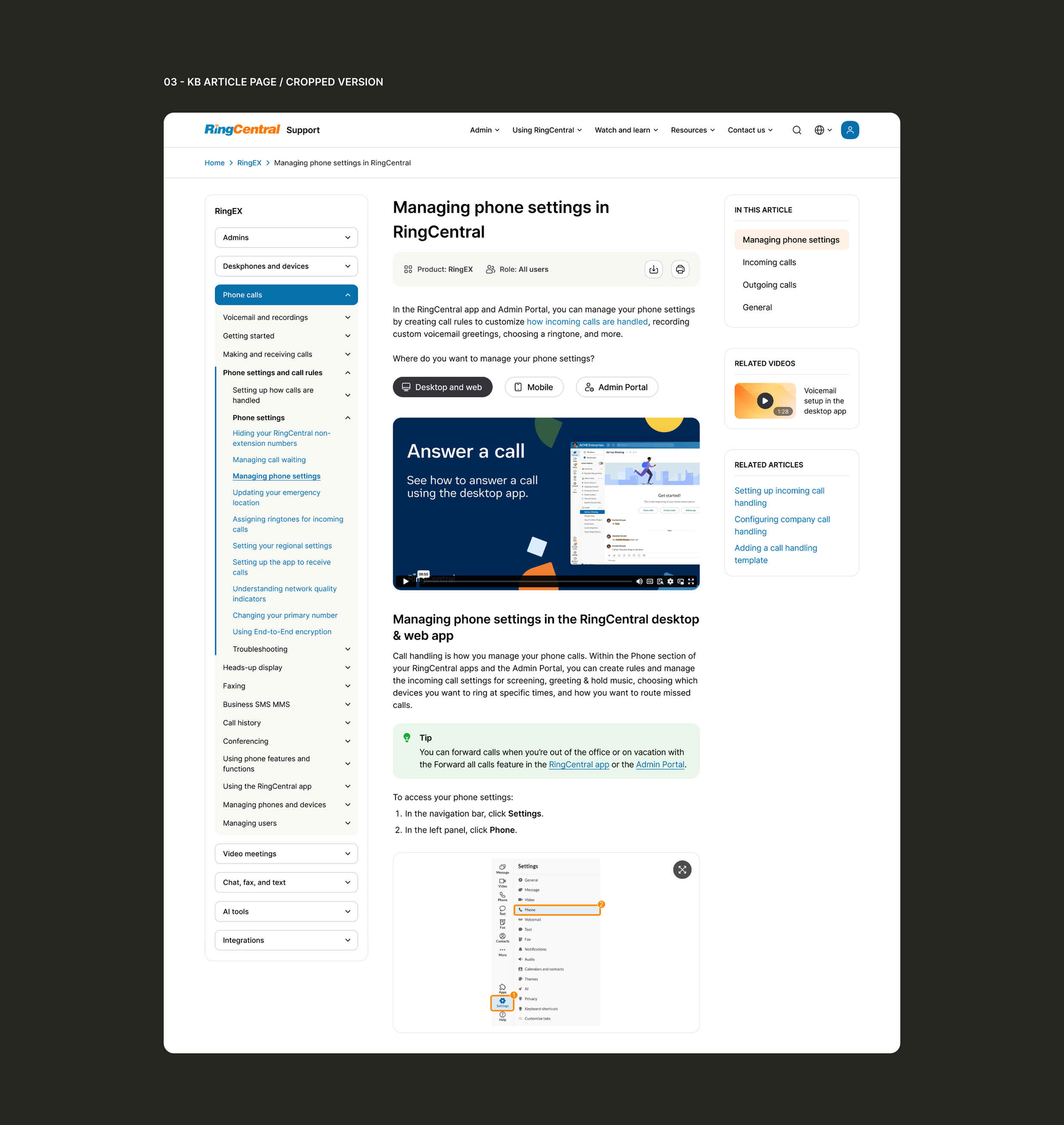
Missing navigational aids (e.g., breadcrumbs)
Taxonomy and content organization issues
As a result, users struggled to find relevant information efficiently, leading to frustration and an increased reliance on customer support channels.
My role
I was responsible for identifying UX challenges, defining the new information architecture and navigation, designing core user flows, and delivering final UI aligned with the design system.
The process included competitor analysis, site mapping, wireframing, iterative validation with UX leadership, and close collaboration with content teams responsible for taxonomy and structure.
Approach
Given the scale and complexity of the platform, I started the redesign with:
UX audit of the existing experience
Competitor analysis of large support ecosystems
Site map definition
Wireframing of core pages and flows
The UX strategy prioritized core user jobs, focusing on key needs such as resolving issues efficiently, understanding product functionality, discovering relevant educational resources, and navigating a complex multi-product ecosystem.
Key UX improvements
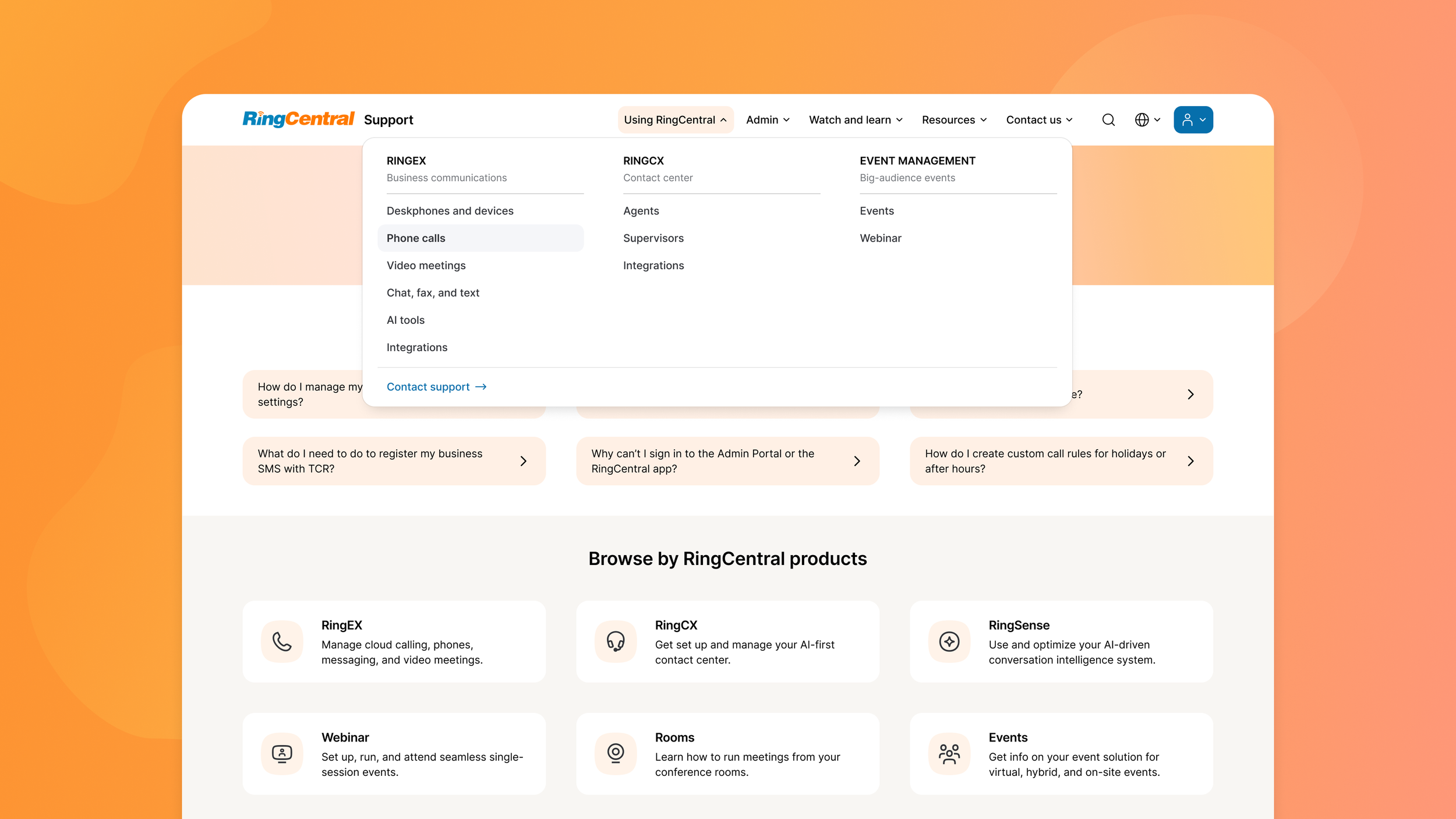
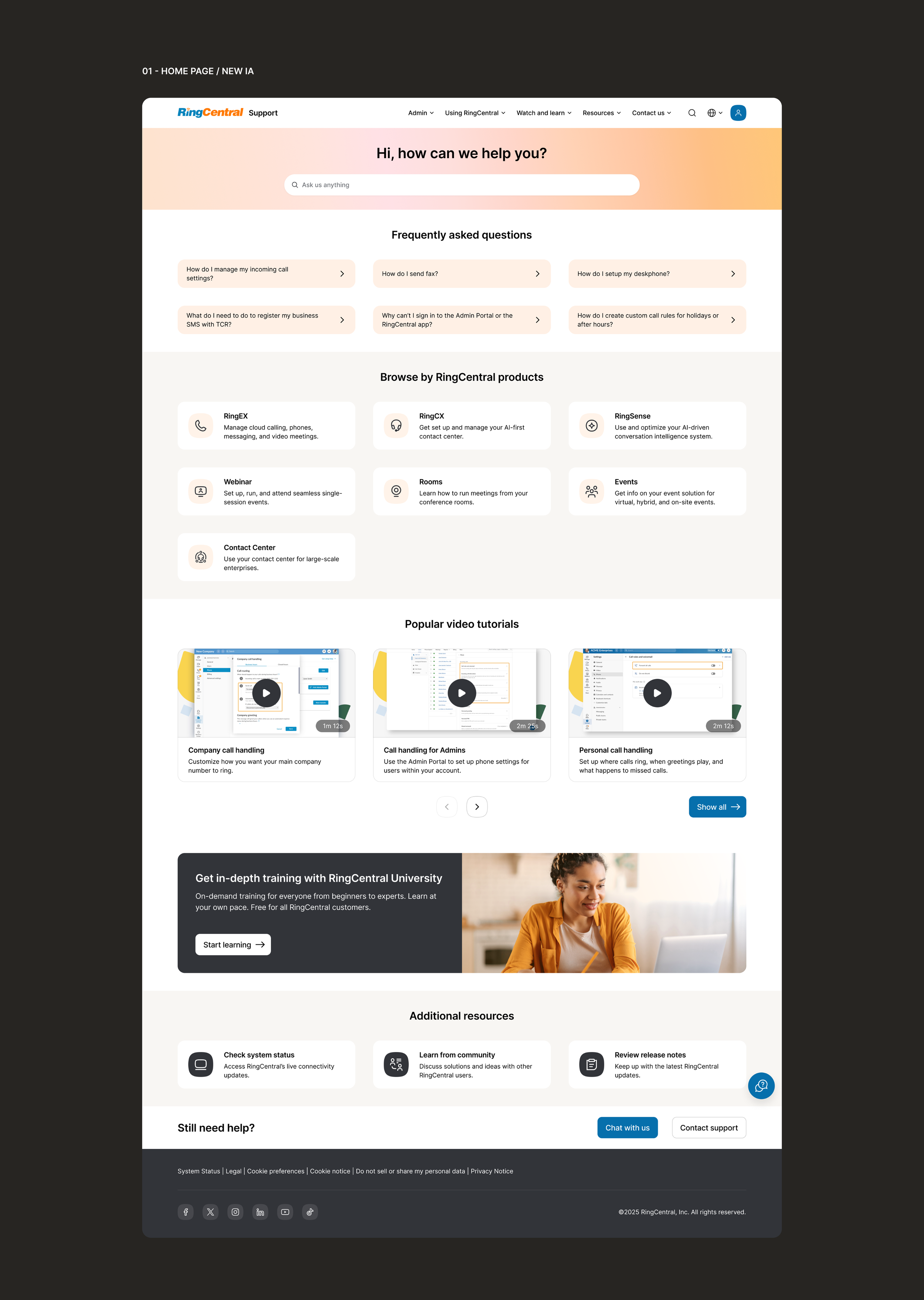
Global navigation
A structured top bar navigation menu instead of fragmented entry points.
Improved information architecture
A clearer and more predictable hierarchy enhances overall content discoverability and navigation.
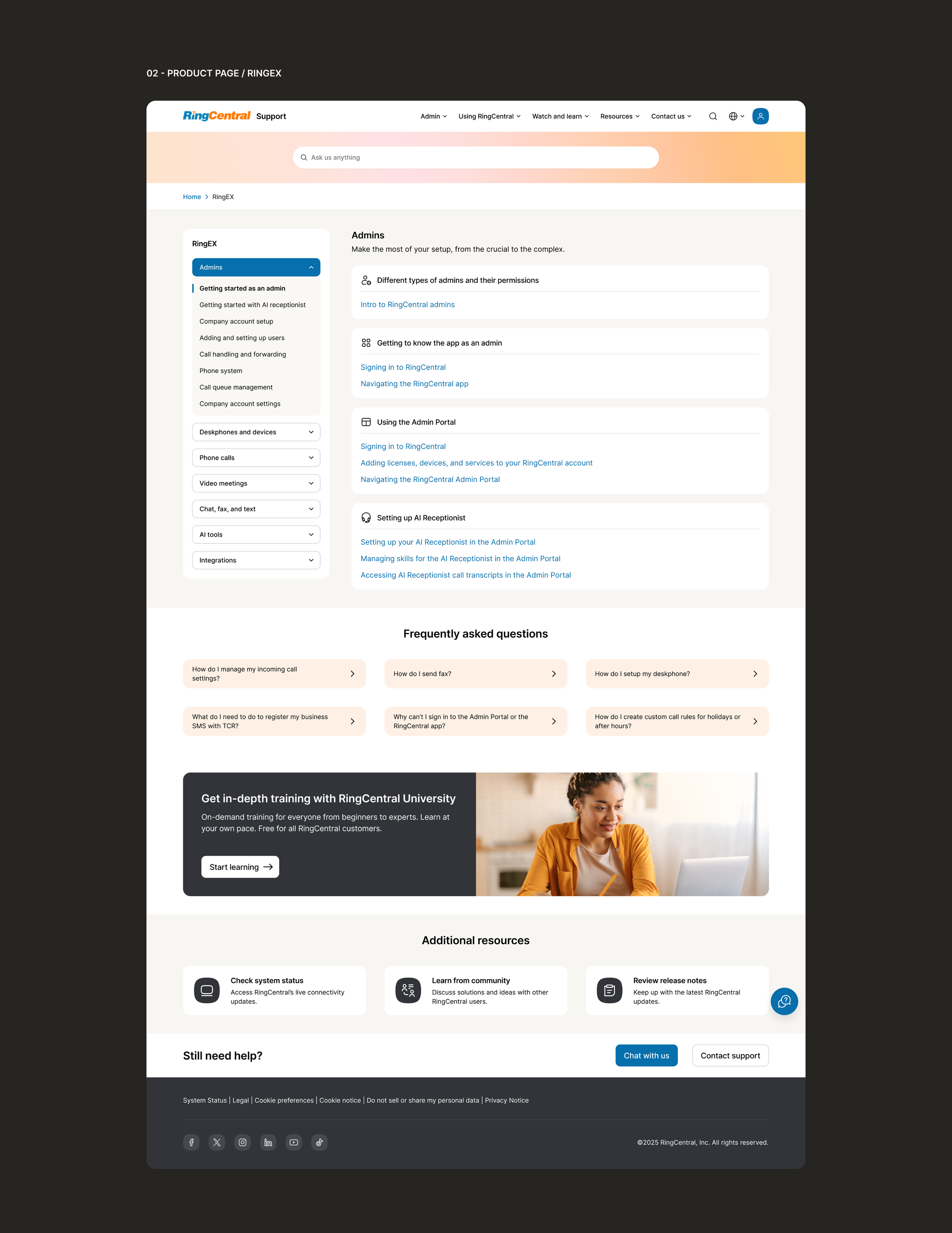
Simplified nesting levels
Excessive levels of content nesting were removed, improving access efficiency.
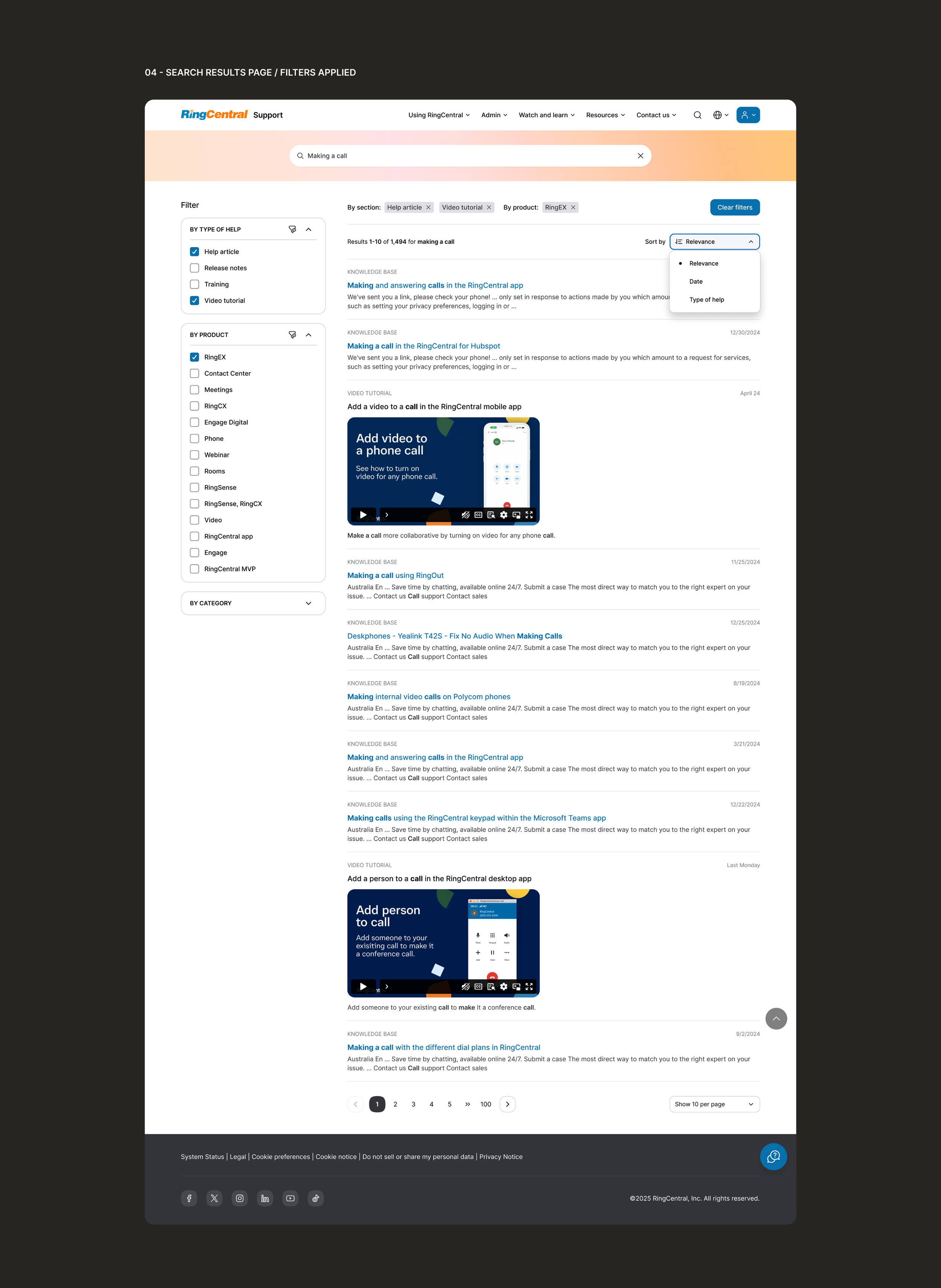
Product-centered structure
Redesigned product and KB articles pages with left-side navigation with categories and subcategories, simplifying access to the topics.
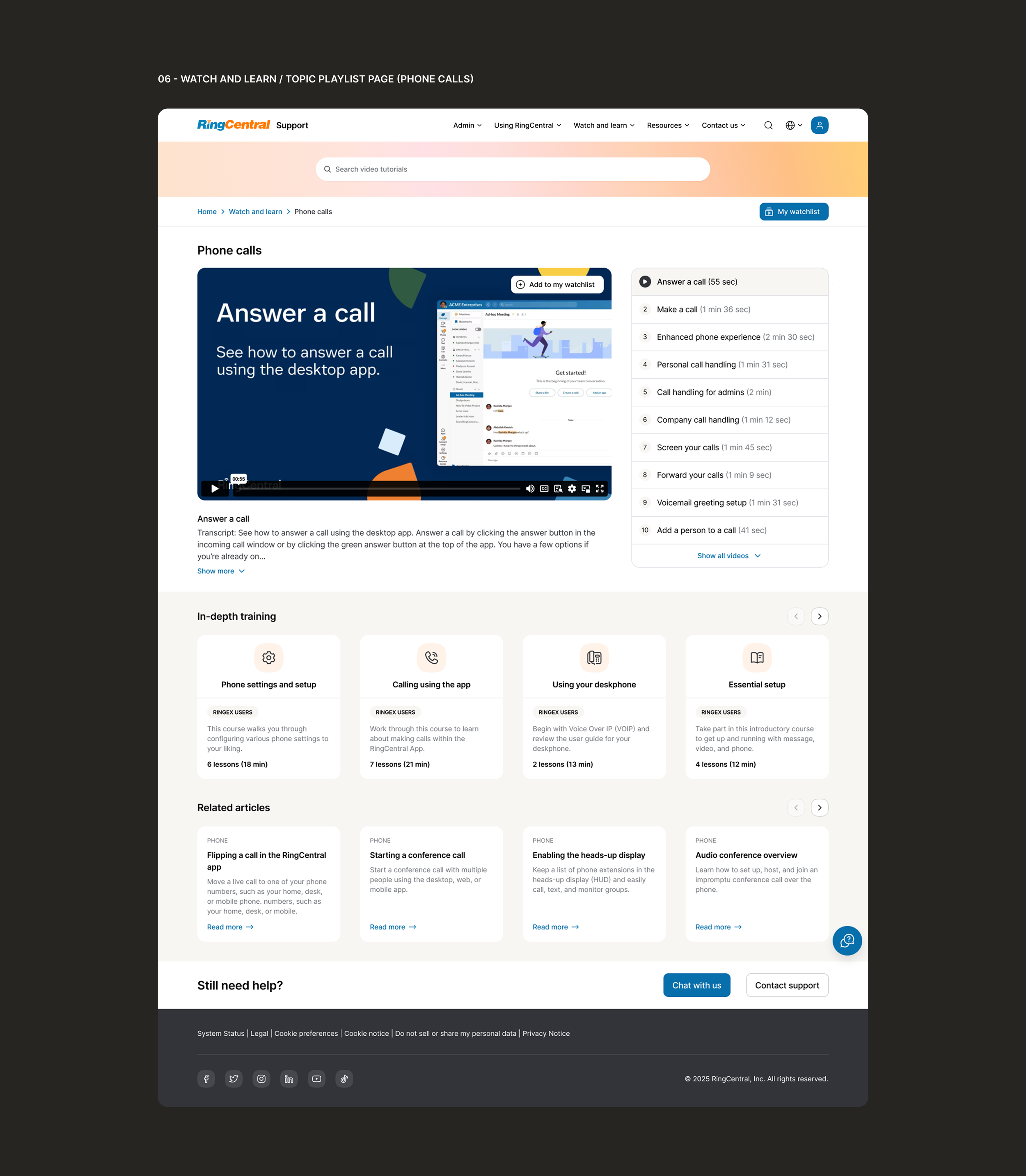
Embedded RingCentral University
Integrating RingCentral University into the support ecosystem enabled users to access self-paced, in-depth product learning.
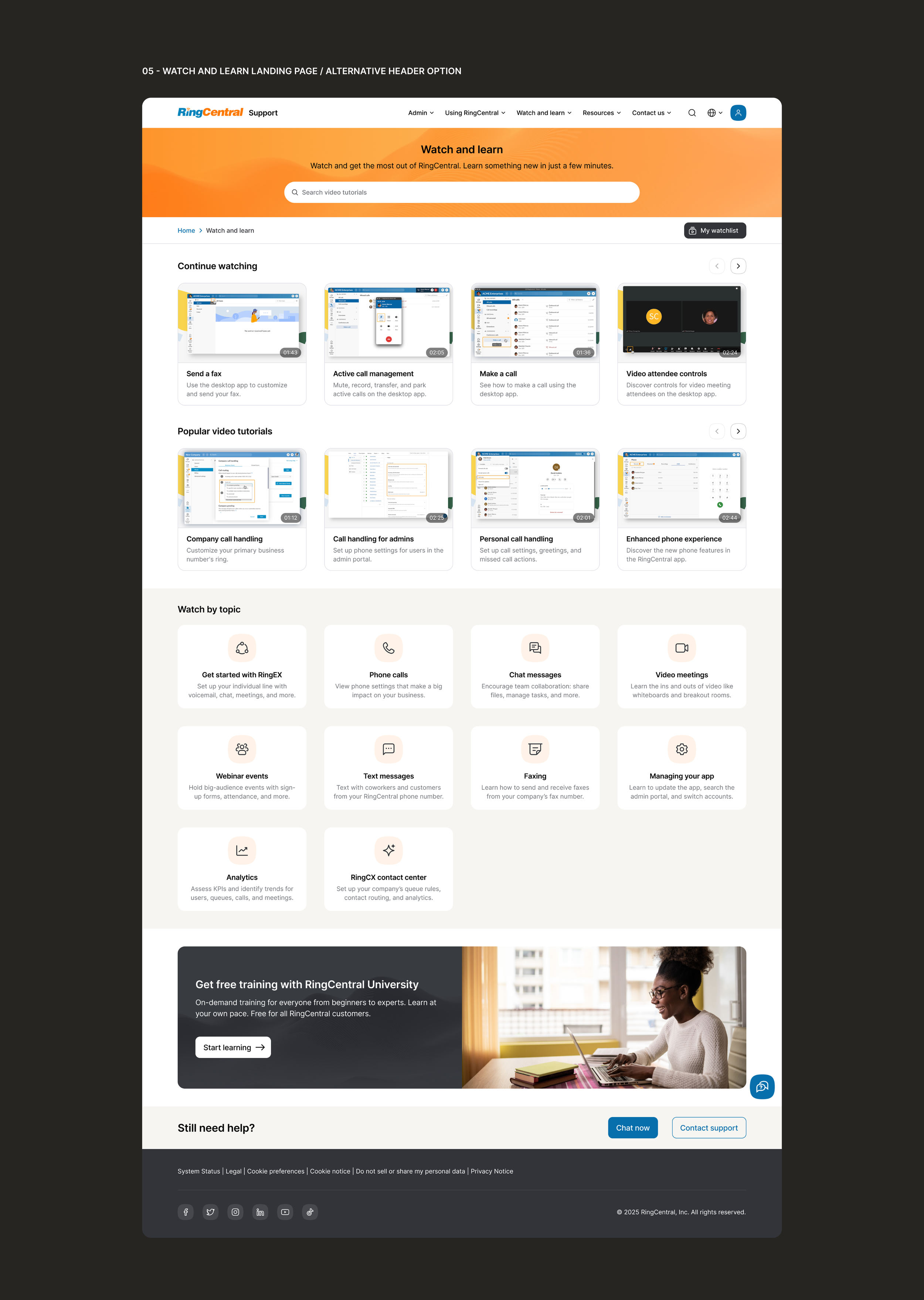
Watch and learn experience
A dedicated video-learning environment enabling users to browse categorized how-to videos and access related educational content.
Challenges
The project was executed within a dynamic organizational environment:
Frequently changing stakeholders and leadership
Evolving requirements and priorities
Platform complexity due to a large volume of products and content
One of the primary design challenges involved creating a clear and scalable navigation system for content-heavy product ecosystems as the taxonomy continued to evolve.
Outcome
The redesign established a more structured, intuitive, and user-centered support experience. Although no specific metrics are included, stakeholder feedback indicated positive impact, improvements in usability, and overall support effectiveness as the new designs were gradually implemented.